February Inflation
Important considerations for one of the most pivotal datapoints of the year
The Fed pivoted to the intention of cutting rates in October ‘23, which has buoyed markets since as Trillions of US Dollars aim to escape short-term money-market holdings, where the clock appears to tick in terms of their generous yield, to replace them with longer duration assets
This has perhaps unleashed a self-fulfilling circuit, as the forward guidance to cuts in the future was enough to translate into looser financial conditions today, inviting back inflationary pressures down the line. A first shot across the bow in that direction was the unexpectedly high January inflation print. Now, all eyes are on the coming February data to judge whether we’ve been served a seasonal fluke, or whether a “pivot from the pivot” may be necessary
While government releases such as the US CPI are some of the important events for public markets, they also contain a fair degree of randomness given their often opaque and arcane survey methods. So any predictions are to be taken with much caution. Nevertheless, two current inflation trends are worth highlighting that suggest upside risk to the February CPI estimate
As always, this post closes with my current outlook on markets
Let’s dive in and unpack the two inflation trends worth highlighting
First, on Services
As alluded to above, many commentators as well as some Fed governors wrote off the hot January CPI number as seasonal aberration in a broad disinflationary trend. Now, according to a 2019 paper by the Fed itself, there is indeed seasonality to be found at the start of the year

However, crucially, these findings attest the historically observed seasonality mostly to goods prices, which moves in a much more fickle way than services prices, which typically face much less volatile demand
Looking at the details of the January CPI print, aside of Shelter which is discussed below, it turns out that the hot reading was mostly driven by services, which can be summarised in a “supercore” measure. Below chart by SuperMacro illustrates this well

This speaks to seasonality playing a lesser role than commonly presumed for the January CPI surprise. Further, it would be reasonable for services prices to continue their upward drift for a while longer, as their ebbs and flows are typically lethargic
We will get some indication to the durability of this trend before the February CPI is released. The ISM Services survey issued on February 5th tracks service pricing, it showed a meaningful jump for January before
Summary: Services as measured in supercore inflation contributed substantially to the hot January CPI number. Given the lethargic nature of services pricing, it is reasonable to expect some of this to continue in the coming months
Second, on Shelter
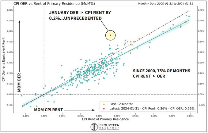
The January CPI contained another big surprise in the measure of housing costs. The housing part of the inflation basket is split into rents as they have actually been paid, and “owner equivalent rents”. The latter is (simplified) a survey asking homeowners for how much they’d rent their own home1
Usually both move in tandem, however, this time the owner-equivalent rents shot up, while actually paid rents stayed down. The chart below shows this historically unusual divergence

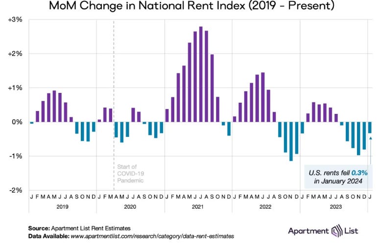
Let’s take a step back and think about whether that makes sense. It is true that the totality of actual rents has been trending down, with little sign of pickup. This is because the vast majority of rents is from apartment buildings (“multi-family”), and there is an oversupply of those that started during Covid and still weighs as units are completed
Here is the crucial part: Most Americans don’t live in apartment buildings, but they live in single-family homes. And most single-family home occupants own their home
Now, since the Fed has loosened financial conditions so drastically with its October ‘23 pivot, single family house prices shot up
Why? Because single family is a structurally undersupplied market facing a growing demographic - you typically buy a home when you start a family, and in the current years many Millennials are reaching that age
The decline in the 30-year yield which drives mortgages from 5% (Oct 31st) to 4% (Dec 31st) was enough to push prices higher in this very tight market
In other words, single-family house prices have gone up, with it the cost of living in a single-family home has gone up, so it would only be logical for that to be reflected accordingly in CPI data
Here is the interesting part- the Bureau of Labor Statistics who is responsible for the CPI data indeed recently implemented changes to the “owner-equivalent rent” survey to adjust better for the fact that the cost of living in a single-family home is much more important than apartment-building rents (see in Jan ‘23 here and again last month here)
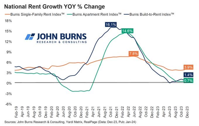
Rick Palacios from John Burns Real Estate Research comments accordingly on the January CPI surprise:
Further, we can see the very different dynamics for single-family and multi-family rents in the chart below. It appears that the CPI methodology has simply been brought in line with reality
Summary: Most Americans live in single-family homes and own them. Accordingly, the CPI index should and now increasingly does reflect the cost of living in single-family homes, which are on a different trajectory than the oversupplied apartment market. While the shelter component of the CPI is highly opaque and complex, it appears reasonable to expect more upside pressure from it as long as the single-family housing market remains tight
Conclusion:
While US CPI releases like most government data come with a fair degree of randomness, clear upside risks exist to the coming February inflation data
These likely originate from services, where higher price resets may persist for some time, and shelter, where the methodology has been brought more in line with the reality of single-family homes dominating housing cost
A “hot” February inflation print would likely force the Fed to “pivot from its pivot” and give up its dovish stance, as the risks of inflation acceleration then likely far outweigh any current risks to the labor market or economic growth
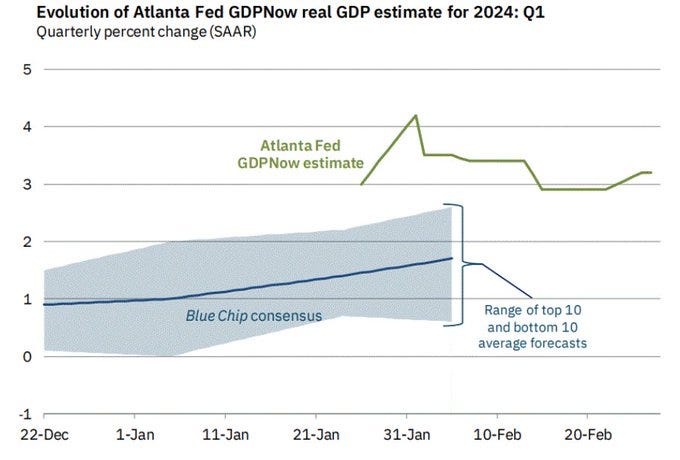
This in particular in light of a US economy that continues to grow at a brisk pace into Q1 ‘24, with the latest GDP nowcast estimates around 3.3% real GDP, or ~6-7% nominal growth (!)
What does this mean for markets?
The following section is for professional investors only. It reflects my own views in a strictly personal capacity and is shared with other likeminded investors for the exchange of views and informational purposes only. Please see the disclaimer at the bottom for more details and always note, I may be entirely wrong and/or may change my mind at any time. This is not investment advice, please do your own due diligence
This is my current stance across short-term and long-term allocations:
Short-term book (Active Trading, Long & Short, Changes Frequently):
I have expressed the view of an accelerating global economy, lead by the US, with the addition of an Oil long as well as two containership longs (Maersk and ZIM), which have given up most of the upside move due to Red Sea disruptions, while these continue to exist. I have also added some Tech Insurer exposure (see this great write-up by Value Investigator), though have to caution that this has run a lot already since. The Google/Semis pair trade went down like a lead-balloon after Gemini’s prowess was overshadowed with woke-filtered responses, so I’ve exited that quickly. I continue to like Natural Gas a lot, which shares many technical commonalities with China in late January. Finally, I’ve re-added the small cap short as well as the Large Banks/Regional Banks pair trade as I would expect interest rates to continue to drift higher. I still see equity market weakness into Q2, so I still keep the S&P 500 puts. Please keep in mind that this is a high turnover book and it may already be different by the time you read this - always do your own DD
In summary:
Long Maersk/Zim
Long Tech Insurer
Long Natural Gas
Long Crude Oil & Long Transocean
Short US Small Caps
Long US Large Banks vs Short US Regional Banks
S&P 500 puts May expiry
PS: I haven’t all given up on Google yet, whose Gemini 1.5 Pro runs at ~10% of the cost of OpenAI’s GPT-4 turbo and has shown great results outside the troublesome woke-related responses which are not very relevant in corporate AI use such as Klarna’s customer service chatbot. So I will continue to follow the situation closely
Long-term book (Asset Allocation for Medium & Long Term):
This book has been started on the 1st February and since performed in line with the S&P 500 at much lower volatility, as the equity components outperformed that index and some good profits could be taken on the AI 2nd-leg basket. However, the main goal of this book is to avoid meaningful drawdowns, which is why the vast majority remains in T-Bills for now as I see little value in bonds or US equities currently. This hopefully changes over the coming quarter, at least for equities. I am patiently waiting. Finally, I have started to do the work on some private credit strategies and on a preliminary look see some market inefficiencies of interest (=excess returns due to capital demand/supply mismatch). A write up on this strategy is in the pipeline for the month ahead
86% T-Bills
14% Equities (5% DAX, 5% XLE, 4% China Equities)
Thank you for reading my work, it makes my day. It is free, so if you find it useful, please share it!


Bravo for digging into rents. IMO ppl have been way too dogmatic about it "lagging" and will decline.
Another fly in the ointment. 80+% of recent apt builds were "luxury", mid grade apt rents still zooming.
I forget which Fed president said it, but basically as long as companies remain willing to plan to raise their prices inflation is a problem. So far he's right. And idk how that ends without a real drop in demand.
Thank you for publishing your thoughts and ideas!